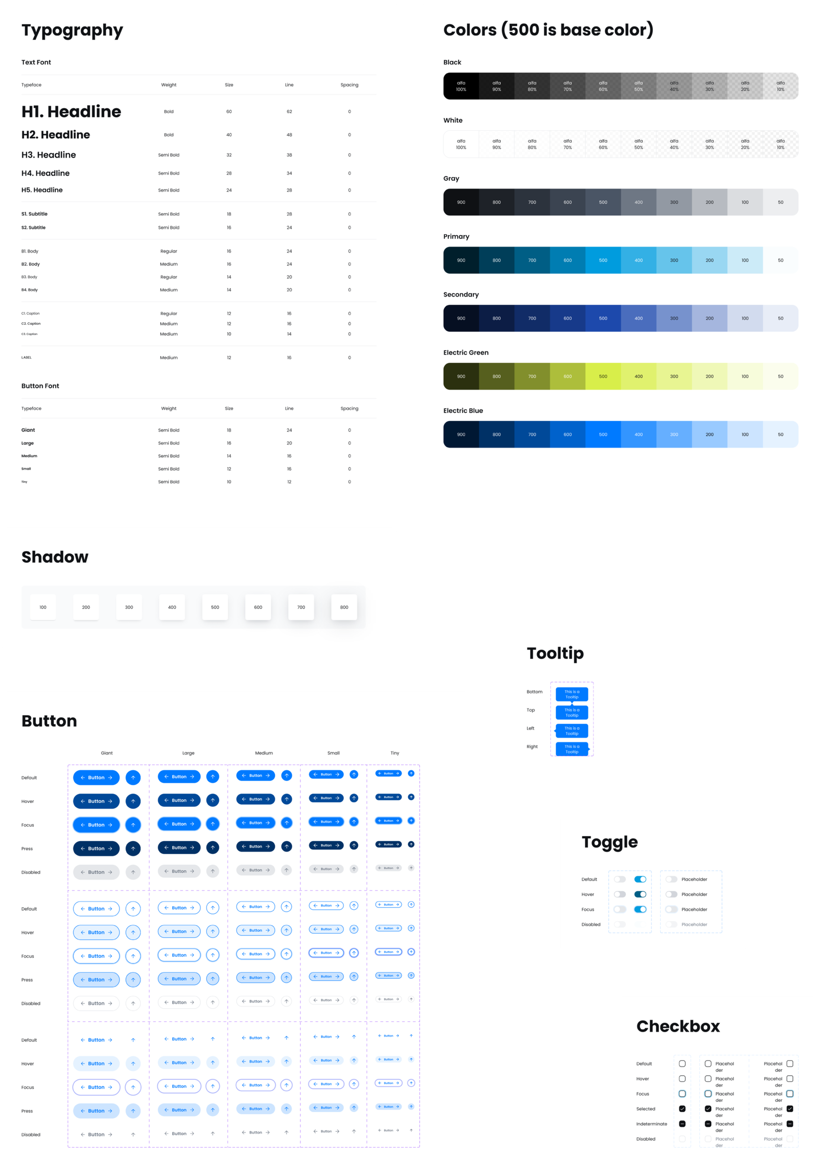
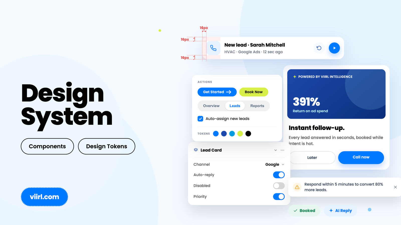
Website redesign focused on improving clarity, trust, and conversion through stronger visual hierarchy and brand alignment. Designed to reflect how the brand shows up in the real world—bold, visible, and instantly recognizable.
Project Overview
Redesign of a Phoenix-based HVAC company website to better reflect their real-world brand presence and improve user trust and conversion.
Details
Role:
Design, UX, Visual Direction
Scope:
Website redesign, layout systems, content hierarchy
Background
The original site lacked visual clarity, brand cohesion, and trust signals. Despite Delta’s strong real-world presence, the digital experience felt generic and low-energy, failing to reflect the brand’s personality or differentiate it from competitors.
Solution
I led the redesign with a focus on visual clarity, tone alignment, and conversion strategy. Every decision was anchored around one question:
How can this brand feel both expert and approachable — without being another HVAC cliché?
- Color & Brand Presence: Used the signature pink as a primary visual anchor to create immediate recognition and differentiation
- Typography & Layout: Built a clear hierarchy with bold headlines and structured sections for fast scanning
- Visual Storytelling: Integrated real photography of team and vehicles to reinforce authenticity and trust
- Conversion Focus: Prioritized key differentiators (pricing transparency, 24/7 support) and implemented consistent CTAs throughout
Results
Before:
- Generic layout with weak visual hierarchy
- No alignment between brand identity and real-world presence
- Limited trust signals and unclear value differentiation
After:
- Bold, recognizable design aligned with Delta’s real-world brand
- Stronger messaging and trust signals supporting conversion
