
A feed-inventory and invoicing app for a working ranch, built to replace $500/seat software.
Context
A family ranch feed operation was tracking inventory on spreadsheets and staring down Sortly’s ~$500/seat pricing for software to fix it — steep for a small outfit whose real needs were narrow: track feed and mineral stock, record who takes what, and send invoices. So I built the replacement — an app they’d own outright, with no per-seat tax.
Role + Stack
Solo — product design, UX/UI, and full build
Vite · React · TypeScript · Tailwind · Supabase (auth + database) · Capacitor (iOS + Android) · jsPDF · Vercel
Problem
How do you make recording feed movement faster than ignoring it — for a whole team with different roles and permissions — while handling real business rules a generic inventory app can’t: separating customer, cattle-side, and family use, hiding cost data from the wrong roles, and keeping an audit trail?
Process
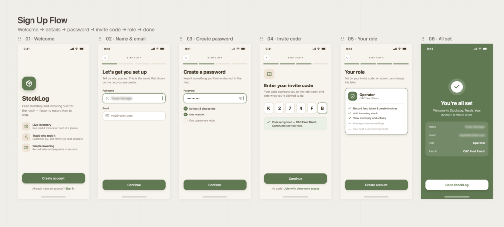
Modeled the business before the screens. The hard part wasn’t UI — it was the rules. C&C owns the inventory; the K2 cattle account draws from it separately; family use is tracked by controlled person records, not free-typed names; and everything has to stay separable in reports as an audit trail. I mapped that domain first, so the design served how the operation actually runs.
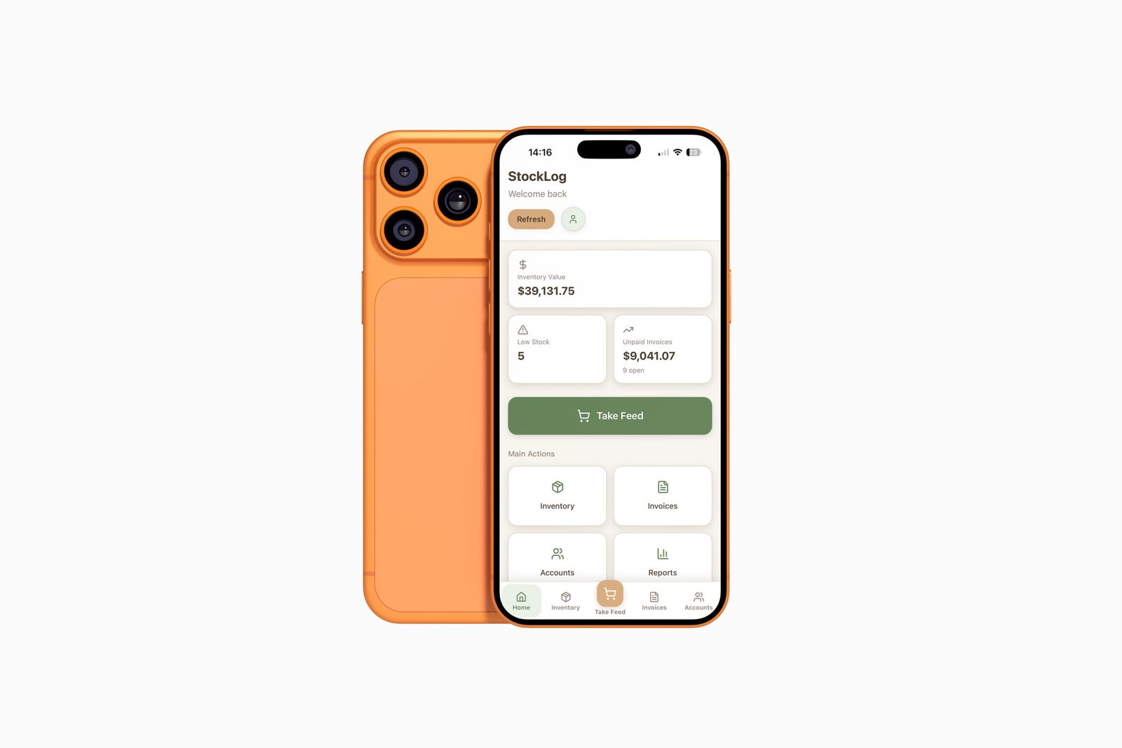
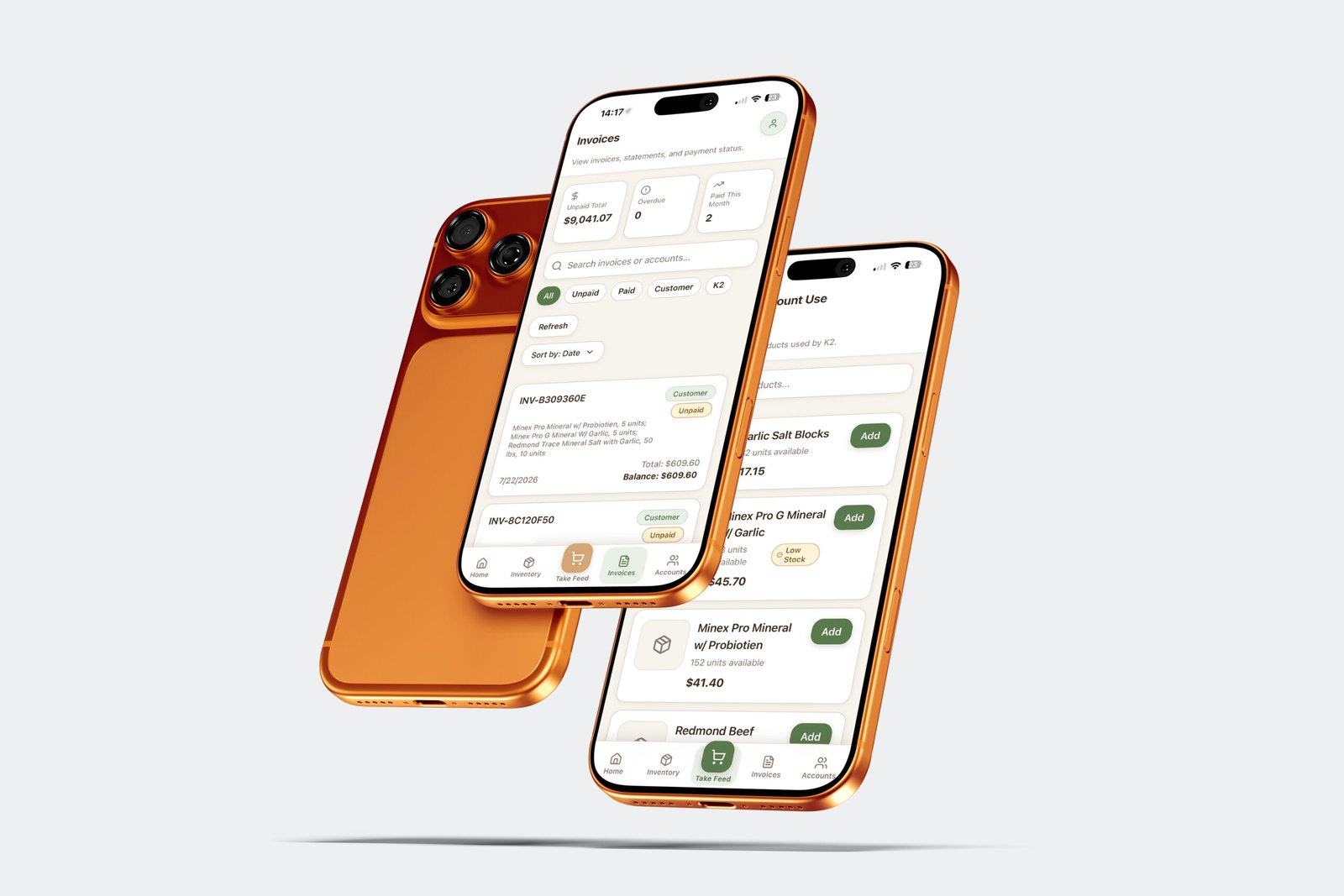
Designed for the fast path. The core action — recording a feed pull — had to be near-instant, so the “Take Feed” flow leads with real-time stock math (available now vs. available after this pull) and a running total. Recording had to beat not-recording.
Role-aware from the ground up. Cost-per-unit is hidden from Operator and View-Only users; admin tools appear only when permitted. The same screens adapt to who’s holding the phone.
Key Decisions
Designed and built it, not handed off comps. I modeled the data, wrote the logic (inventory valuation, available-after-use math, invoice balance tracking), and shipped it to both app stores. The design is inseparable from the system underneath.
Purpose-built to kill the per-seat cost. Rather than clone Sortly, I built simpler – just what the ranch needs – but added what Sortly didn’t: create, save, and print invoices, which was a direct team request.
Shipped to real constraints. iOS was straightforward; Android’s Play Store requires 12 testers I didn’t have, so rather than stall, I gave Android users the testing-track link – they’re up and running today while the store listing waits. Ship beats perfect.
Outcome
In daily use by the entire team at the ranch. I maintain it against live feedback — feature requests and fixes come straight from the people using it, and I ship them as they come. It replaced both the spreadsheets and the Sortly subscription.