Design System

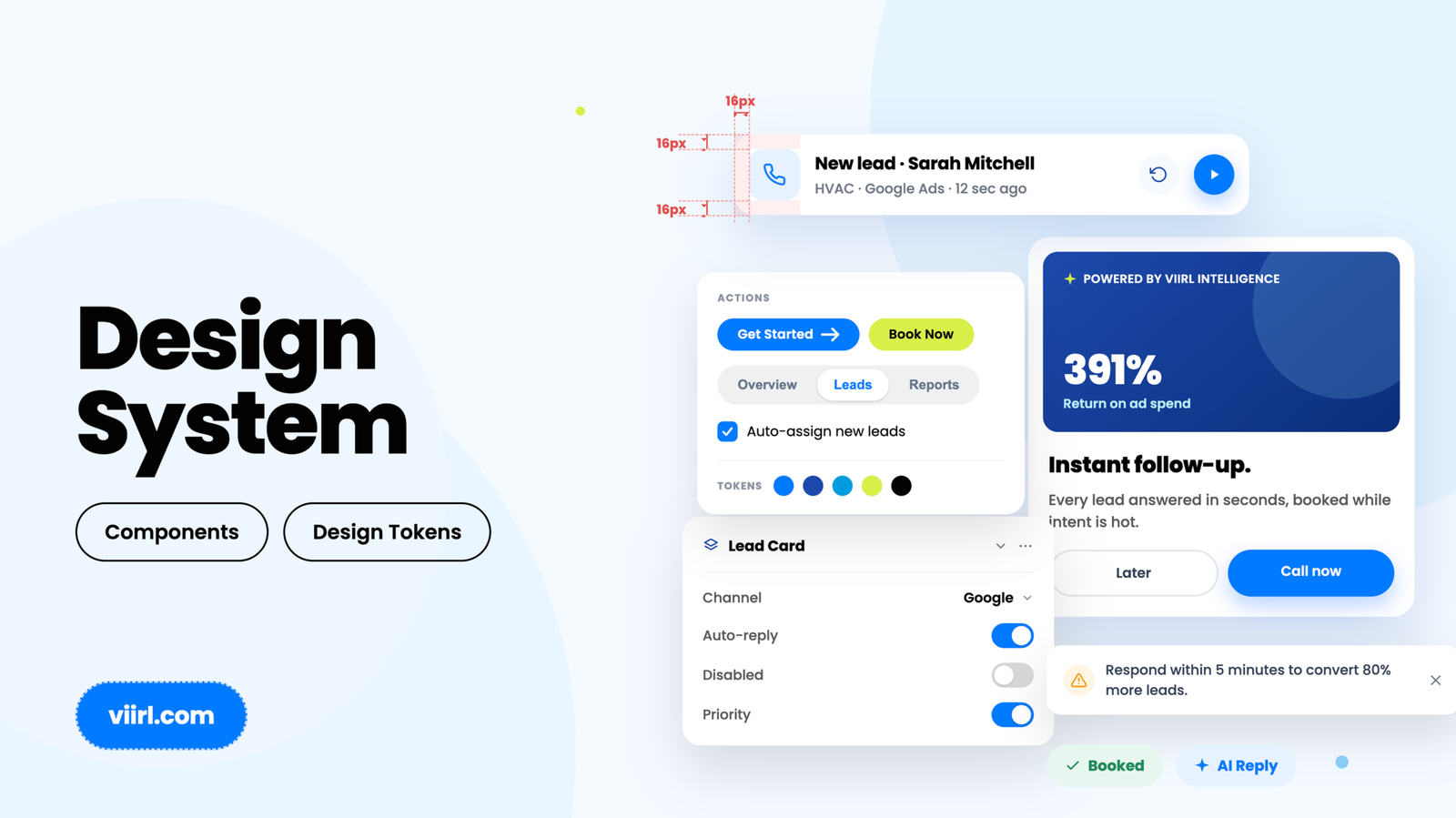
A token-driven UI system built for VIIRL — and structured so an AI can build from it.

Context

VIIRL’s work spans a lot of surfaces – marketing sites, product pages, landing pages, a portal – and keeping them visually consistent by hand doesn’t scale. I built a token-driven design system to be the single source of truth underneath all of it: color, type, spacing, and components defined once, as named tokens, not re-decided per screen. And because I work fluidly between design and code, I built it with a second goal most systems ignore – to be readable and buildable not just by a team, but by AI.

Problem

How do you make a design system that actually holds – one where consistency is the default, re-theming is cheap, and the gap between “designed” and “built” is as small as possible? And how do you structure it so the fastest path from token to working UI can run through an AI, not just a developer?

Anatomy

The foundation

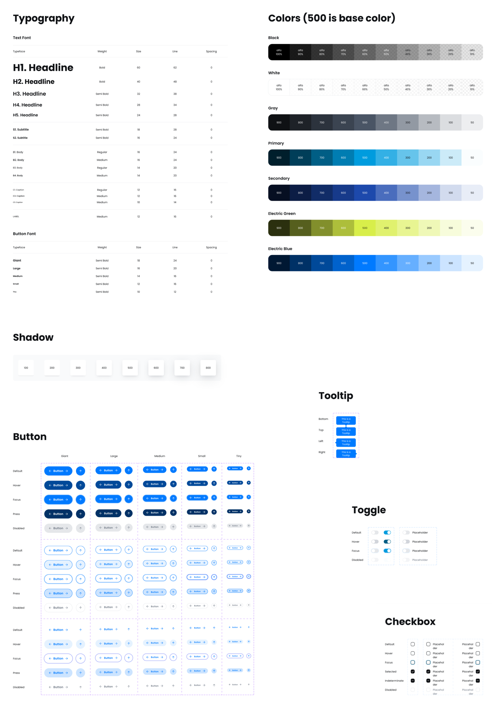
Color, type, spacing, and components defined as named tokens, not one-off styles.

Why tokens

Everything is a named token, so the system is built to scale instead of sprawl: change a value once and it updates everywhere; re-theme a whole product without redrawing a component. The button matrix alone defines every state and size as reusable variants, so building a new screen becomes assembly, not redraw.

System in use

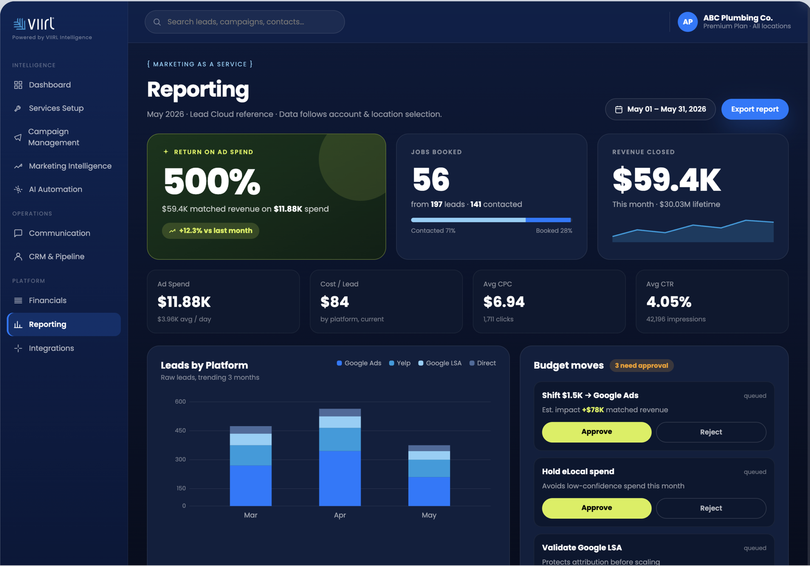
The same tokens composed into real screens — and re-themed without redrawing a thing.

Built to be AI-buildable

I structured the tokens so a machine can read the system, not just a designer. Feeding the token definitions to Claude, it can generate on-system UI that already matches the spec – right colors, type scale, spacing, components. Design that helps ship itself.

Reflection

The team’s been building on it for about a week now, and I tweak it as real issues surface – which is exactly how a system should mature: proven and refined through use, not in a vacuum. Next: a published token package any dev, or agent, can pull in and stay on-system by default.